Design Life Now: National Design Triennial
exhibition catalogue
visual identity, font design, book design
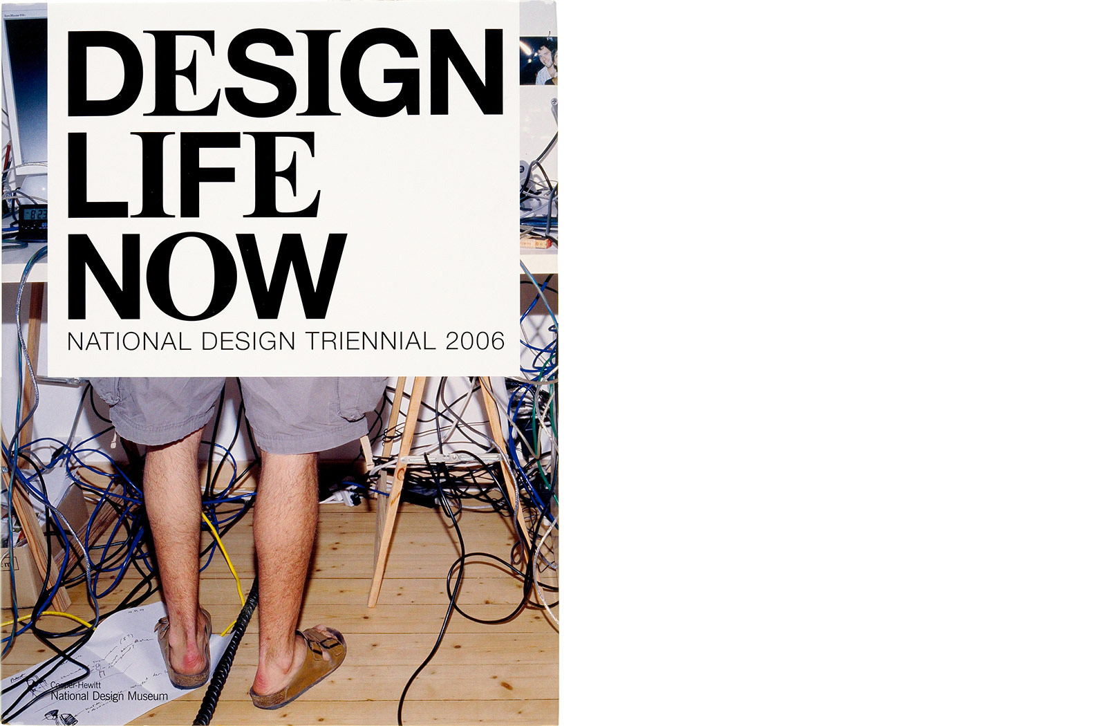
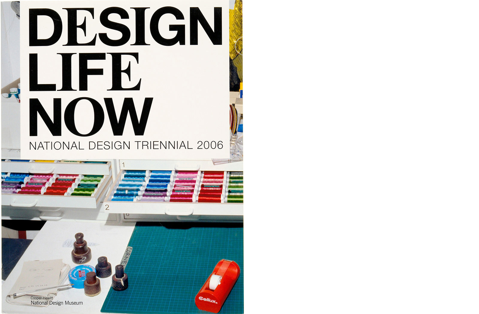
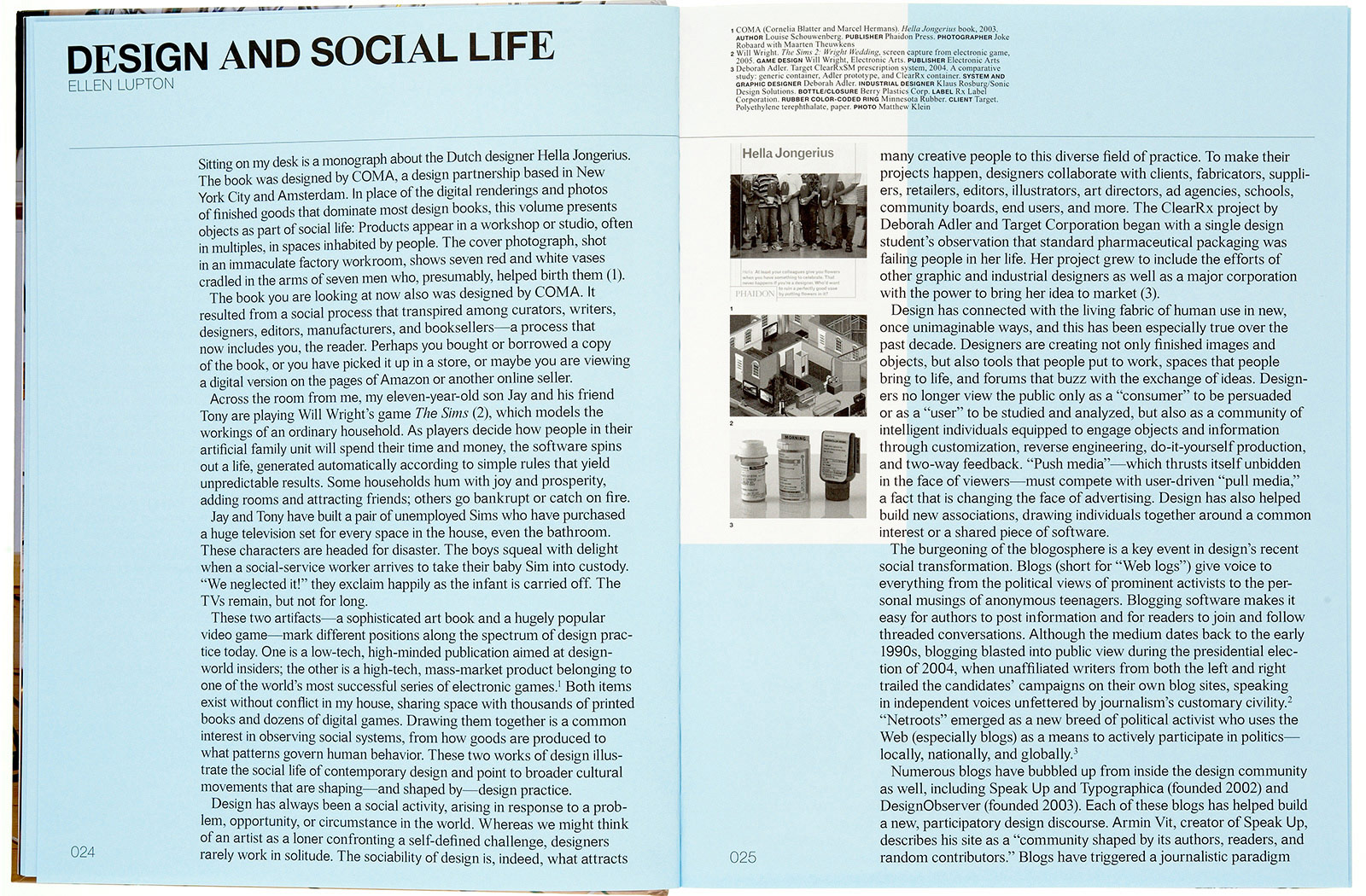
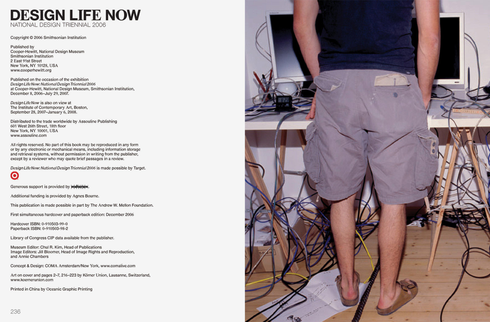
The National Design Triennial at Cooper-Hewitt brings together experimental designs and emerging ideas at the center of American culture. Published to accompany the Design Life Now: National Design Triennial 2006, this catalogue features 87 individuals and companies that are changing the face of design, including COMA, Pixar Films, Apple, Google, Nike, Target, Narciso Rodriguez, Tobias Wong, Santiago Calatrava, Herman Miller and NASA.
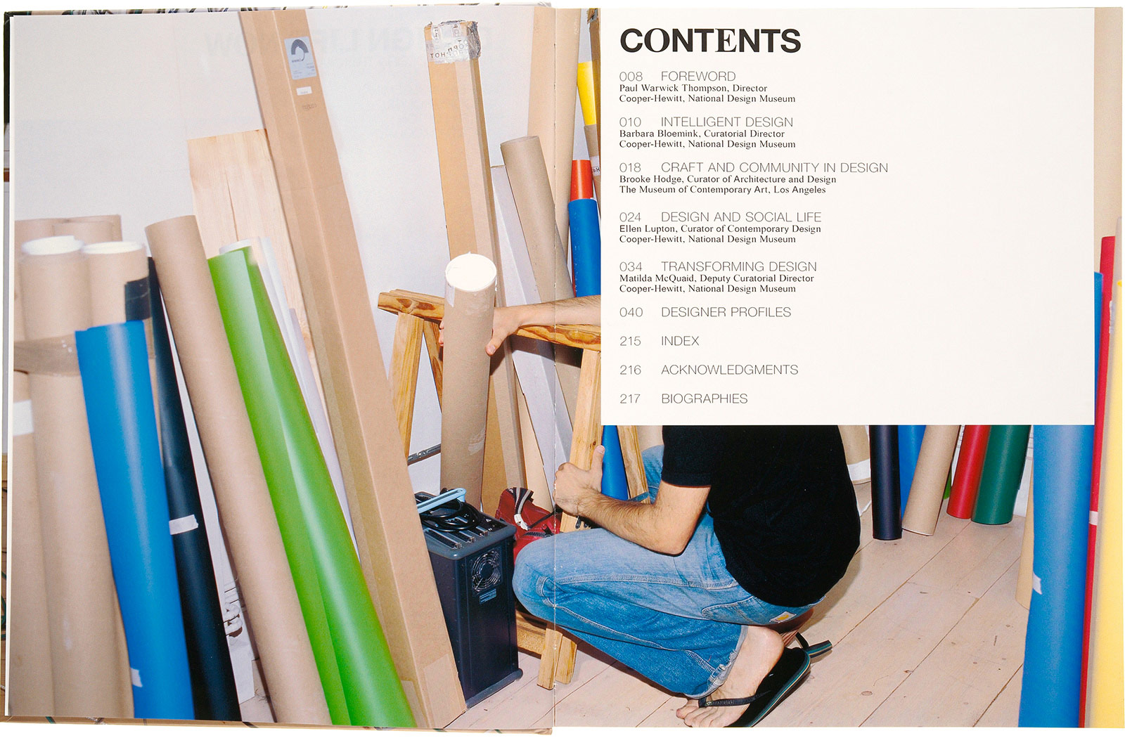
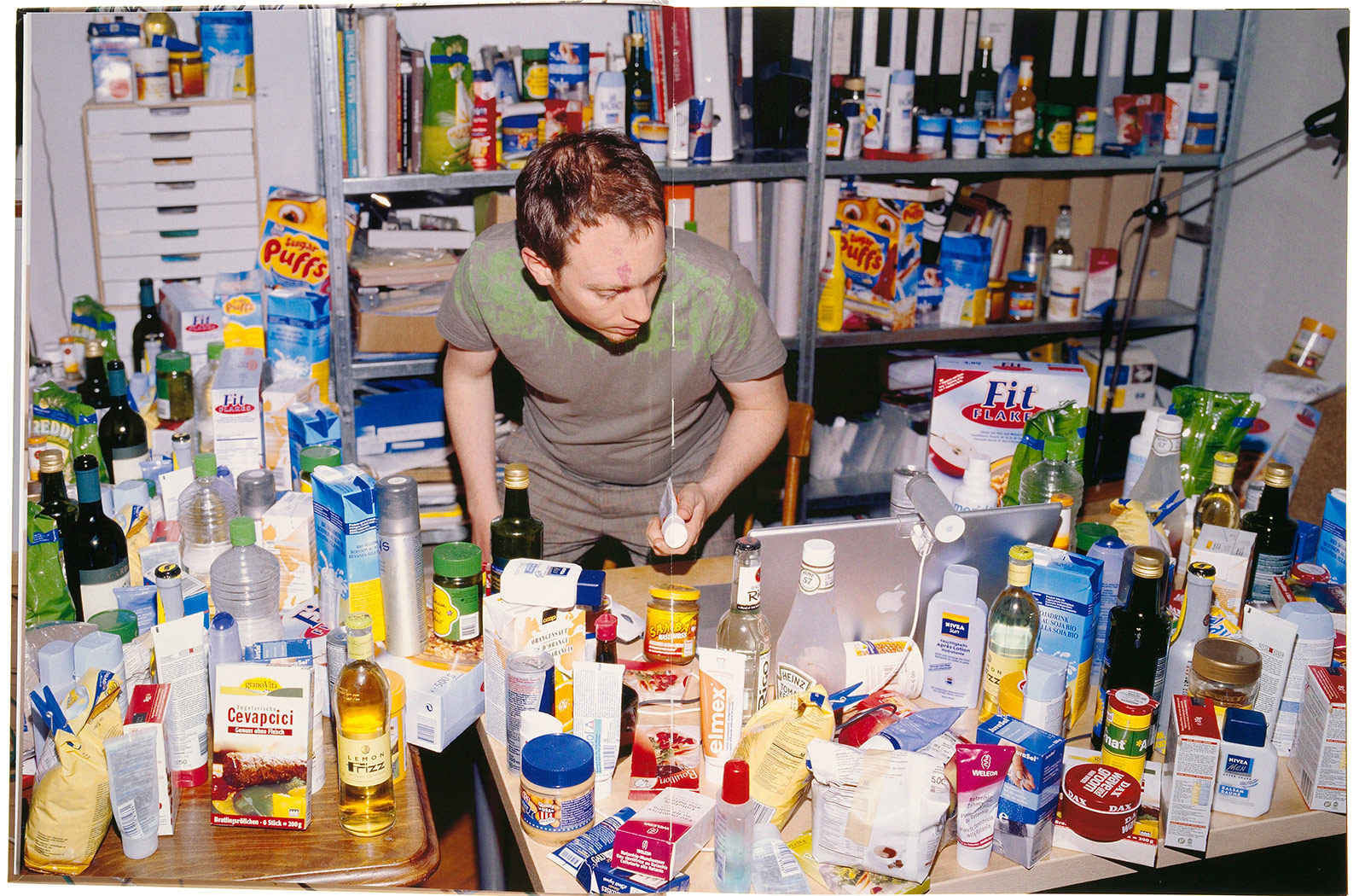
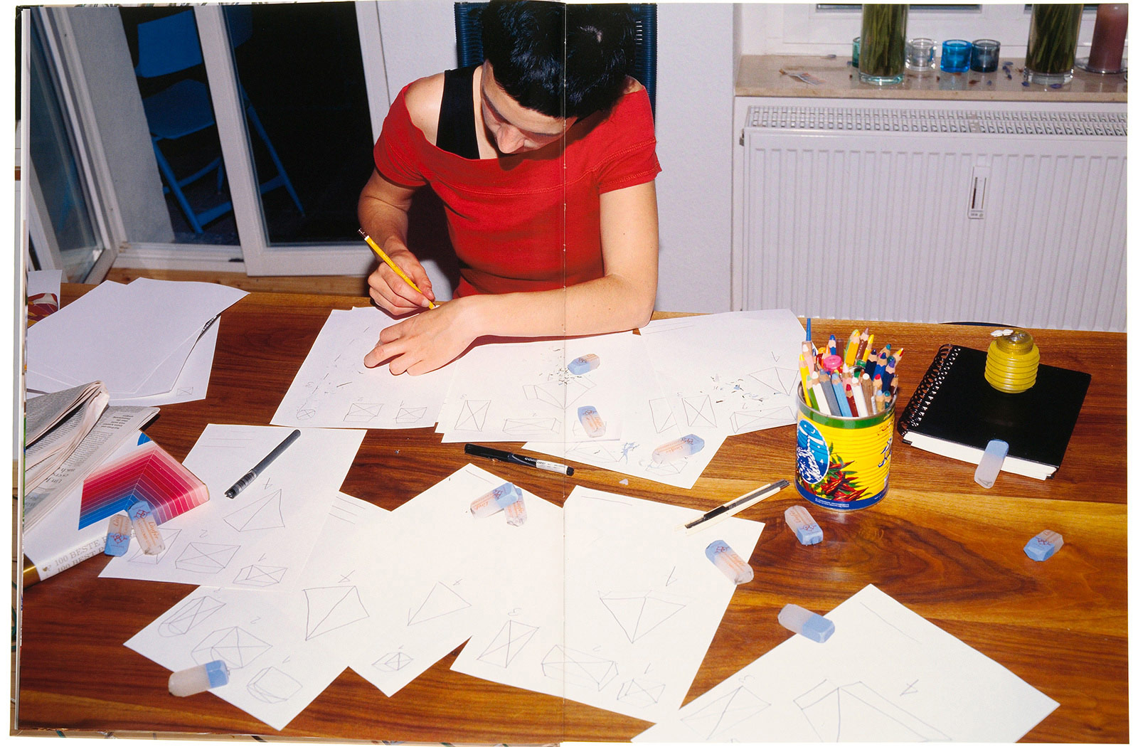
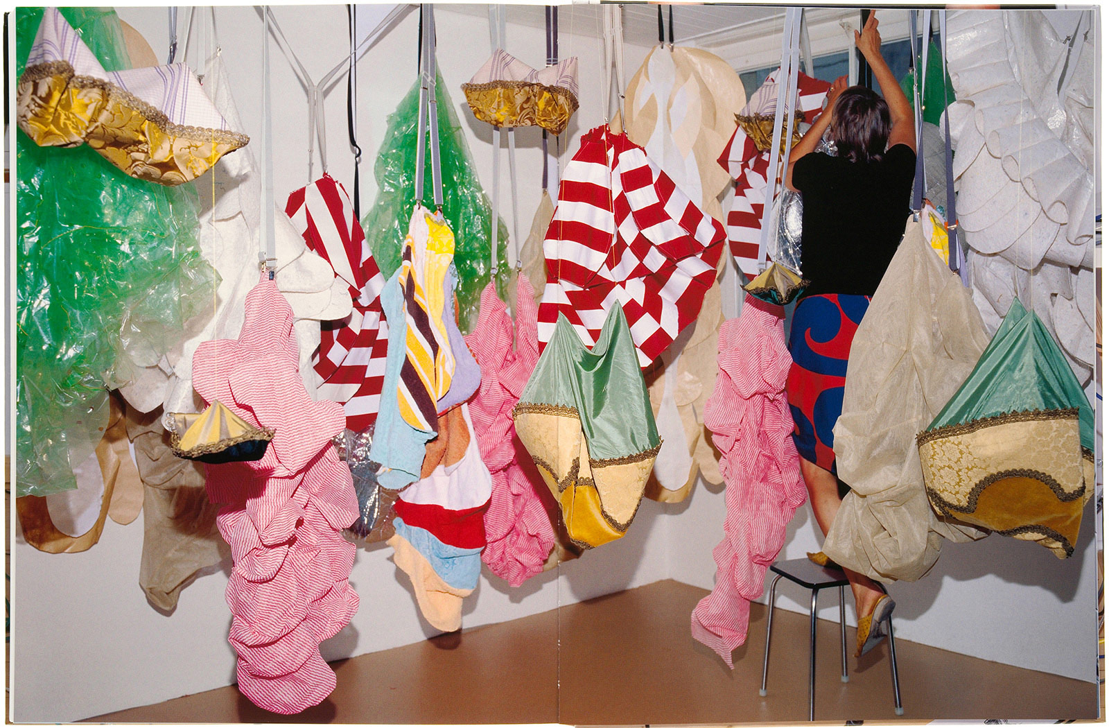
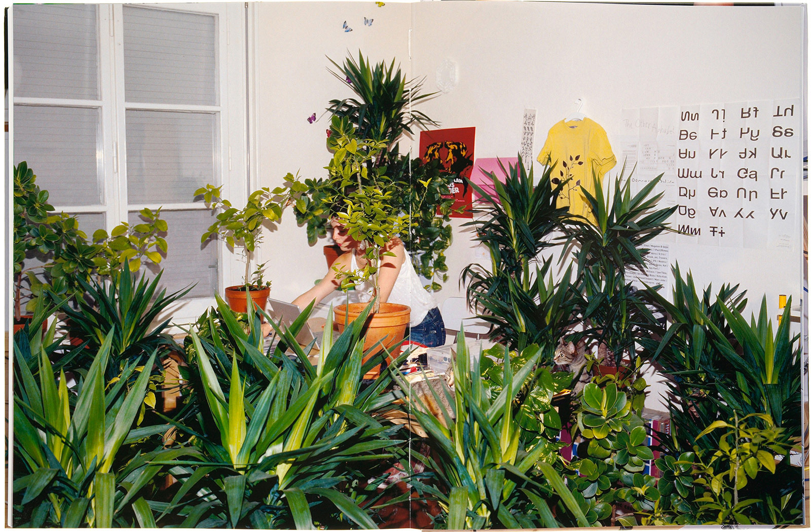
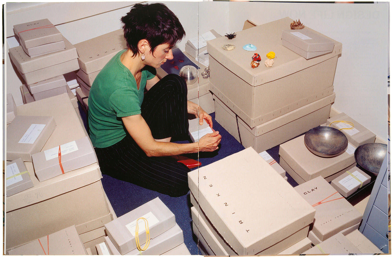
design Photographs of designers at work reinforce the social aspect of design. The absence of a notion of clash in design prompted the forging of a new font by combining two contrasting fonts—Times Roman and sans-serif Helvetica—to create Clash Sans and Clash, one used for consonants and the other for vowels. Familiar elements reinterpreted to produce something totally fresh.
client Cooper-Hewitt National Design Museum. Every three years the Cooper Hewitt’s renowned Triennial exhibition series showcases some of the most exciting, provocative, and innovative design created around the globe. The Triennial seeks out and presents the most innovative American designs in various fields, including product design, architecture, furniture, film, graphics, new technologies, animation, science, medicine, and fashion.
collaborators
Barbara Bloemink, curator
Brooke Hodge, curator
Ellen Lupton, curator
Matilda McQuaid, curator
Chuck Kim, editor
Körner Union, photography
collection
The Art Institute of Chicago
articles & links
Design Life Now: National Design Triennial, store
Cooper Hewitt National Design Museum, review
AIGA, review
new york times review
“…The human eye and psyche need a degree of newness, and it is often surprising how little it takes. Among the freshest things in “Design Life Now” are the two new fonts, Clash Sans and Clash, designed by COMA for use in the exhibition’s catalog and labels. Both fonts simply combine the two existing, classically opposed fonts Times Roman and sans-serif Helvetica — using one for consonants and the other for vowels. Despite the comfortingly familiar elements, the fonts look as a whole like nothing you’ve quite seen before…”
—ART REVIEW, New York Times, December 15, 2006.
Roberta Smith, “DESIGN LIFE NOW: Fruits of Design, Certified Organic”